Bust out the lab coat and lightning catcher, we’re going to make a Daiso Frankenpen!

I’m lucky enough to live near a Daiso Japan store, which is essentially a Japanese dollar store. Just about everything in the store is $1.50 unless otherwise marked. However, unlike some dollar stores, it’s not chock full of irredeemably poor quality stock. Quite frankly, the quality is beyond what one expects for $1.50 on just about everything in the store. An excellent example is this $1.50 fountain pen, made by Platinum, exclusively for Daiso. It only ever comes in a medium nib and only in that beige barrel and cap color. But, the fittings come in random colors. To put it in the words of a very cheerful employee when I asked when I might see one with black fittings again, “oh, I’m not sure. They just send what they feel like”.

Daiso Platinum Riverie Fountain Pen $1.50

Platinum also makes this black brush pen with an identical design, also available for $1.50.
Daiso Platinum Brush Pen $1.50

At $1.50, both the fountain pen and the brush pen are tremendous bargains. The brush pen is easy to control, with a lush feeling as you draw with it. The fountain pen, I intend to review here next chance I get. But in brief, it writes better than my former Lamy Vista.

However, I’m not so fond of beige. Since, I thought, these two pens are so similar, why not swap the sections out and have a beautiful black/gold-tone fountain pen? This would raise the cost of having this pen to a whopping $3.00, that’s still only 10% of what it would cost to get the aforementioned Lamy Vista.

The swap couldn’t be simpler because the threading on the sections are identical, but it takes a little bit more to get this project up and running than just swapping the sections.

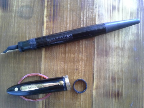
As you can see below, while the threading for both sections are identical, the length of the brush pen section is much longer. This means we will also have to swap inner caps in order for the cap to seat over the swapped section properly.

There’s two ways to go about this. The first is the more complicated one, of using an anchoring drywall screw inside the inner cap to pull it out. I was inspired to try this ingenious idea posted on Fountainpennetwork.com, because I’m working on restoring that Sheaffer dialer pen in my previous post, and I’m experimenting with ways to pull an inner cap. Based on my experience with these green “christmas trees”, I think I would prefer a variety where the anchors bulge from the middle, and not the end like this to apply a gentler and more even pressure to the inner cap.
The upper inner cap still has the anchoring dry-wall screw inside it.

The much simpler way is to use your thumb to push the cap clip up and out of it’s seat, and use something appropriately skinny to poke the inner cap down and out of the cap.
Platinum riverie cap clip removed

Once the inner caps are popped out, just swap them out and push them back up and into their new host caps. Then cap them onto the pen with the matching section to snap everything in place.

Now, if you’re lucky, Daiso has a fountain pen with black fittings in stock and just by swapping out the entire nib/section assembly and changing out the inner cap, you would get a really swell looking pen like this:
2013-07-23 23.51.01

Of course, it’s more likely that Daiso will be carrying pens with the blue or red fittings. This produces a much sillier pen. One that’s not really worth doubling the, albeit very trivial, cost of procuring these two excellent pens for.
Daiso FrankenPen V01

My second thought after swapping the brush pen section for the blue one was: What if I could cut-down the clear brush pen section to match the length of the fountain pen section, and modify it to accept the fountain pen nib and feed?

I nearly pulled the dremel out to do this immediately, but I thought I’d stick with the brush pen to give it a test drive. I’m really glad I did, because the brush pen I have not had this much fun doodling ever in my life. Plus, I’ve fallen in love with the pigmented black in supplied in the starter cartridge. I’m pretty sure the stuff is Platinum Pigment Black. It’s so saturated, fast drying, has ZERO feathering, and ZERO bleed through and show through, and is seriously water proof. I don’t normally like anything about black inks, but this stuff so so black, and so well behaved, and so much fun flowing out of this brush pen, I can’t stop playing with it!IMG_1510

IMG_1511

So Daiso FrankenPen V2 with the clear section will have to wait until I’m done playing with this brush pen, or I decide to head back over to Daiso for a second one.

Leave a comment

Filed under Fountain Pens, Pen Hacks

Bus time = origami time!

A long bus trip for me means it’s origami time! For these long rides, I’m grateful to Nicolas Terry for publishing all of his books in ebook format. You can buy any book in his collection in pring or ebook pdf from his website origami-shop.com and have a pdf copy delivered to you via emailed link in 24 hours. It’s fast, easy, and what I like best is I can load these books onto my kindle so I can carry all of them with me when I travel. The eink makes the diagrams just like paper, and the battery lasts way longer than a laptop or tablet. The only issue I have is you have to scroll from diagram to diagram when zoomed in at full size. It’s a small inconvenience for having so many of my origami books with me when I travel.

image

Leave a comment

Filed under Origami

Sheaffer Phone Dialer Pen

Sheaffer Phone Dialer Pen

So this funky thing showed up in my mailbox. At first I thought it was some DIY repair of a deskpen-come-capped pen.
Actually, that seemingly discolored and stubby deskpen end-piece is a telephone dialer. See, back in the early days of the telephone, you could use the rubbery end of this pen to stick into the rotary dialer of a telephone instead of using your precious fingertips. Perhaps I could use it, 100 years from it’s invention, just like those two-in-one pen/stylus accessories. Talk about retro-style!
Here’s where I get confused: According to David Nishimura’s excellent write-up about the Sheaffer’s Balance, the phone dialer was in production during the early 1930’s, but this pen has dates on it from 1910.
I’m hoping someone on FPgeeks or the Fountainpennetwork can shed some light!

1 Comment

July 24, 2013 · 10:30 pm

Ink Review: J. Herbin Rouge Hematite

I was roaming around at the local book/pen store last week, where I broke down and bought a bottle of inkJ. Herbin Rouge Hematite 1670 Anniversary Edition. This is a red ink that’s got some sort of pigment in it which causes it to shade bronze. It’s original formulation was so full of this beautiful pigment (at least I think it’s pigment?), and that it would clog pens and resulted in a reformulation after being on the market for a year. I love inks that have fun shading properties, and I love this ink.

Rouge Hematite Bottle and Box

First, the ink comes in this lovely little square bottle, with a wax seal on the front and a wax-seal-looking cap to make it look all old-timey-classy-like. Fortunately the cap is really a twist-off cap so opening the bottle isn’t a one-way street. My one complaint here is that the bottle neck is so narrow and long. Combine this with added obstacle of highly saturated red ink all over the lip, and you get bloody red hand every time you fill a pen up because you’ve got to get your pen through the narrow neck, where the pen barrel, and probably your fingers too, touch the lip and sides of the neck. I wider opening here would have been welcome.

Bottle-neck. Literally.

I had imagined the red would lean a little more on the blue side, but is more of a magenta/pink sort of red. Very bright, and the metallic shading is more bronze than gold. Other pictures I’ve seen of it made it look more like gold. It did seem that way at first, but the next day, the ink had definitely settled into a darker and warmer bronze look than gold. The writing sample is written on a sheet of Black ‘n’ Red notebook paper, using my Oberthur Sequoia Pen, with a custom ground italic stub nib.

Rouge Hematite Handwritten Review

Don’t mind the smear over the layering example. That was the result of some wet paper towel drifting over it after I blotted out the drip test.

Here’s a link to the full-size hand-written review

And a close-up look at the sediment that makes that wonderful shading. The bottle comes with a little warning that this ink is highly saturated, and should not be left in a pen for days at a time. I found it did gunk up my Oberthur Sequoia a bit, but I did in fact leave the ink in there for about 5 days, and after a little bit of hard starting, it did seem worse for the wear. Mind you, I DID take the nib, feed, and section apart and wash each piece thoroughly when I was done, and a TON of inky gunk came out. I would not recommend using this ink in a pen you can’t take apart and clean piece-by-piece.

Rouge Hematite Sediment Close-up

In general, I was expecting a lot from this ink. While it did have some surprises for me color-wise. It has exceeded my expectations in terms of characteristics and behavior. It’s not an everyday ink by far, but if you’re looking for an ink for a special-occasion (and have a not so special pen to use for that occasion), I can’t think of very many inks that are as special as this one.

P1020131

Handwriting close-up

1 Comment

Filed under Ink Review

Light tent and a preview of things to come

Light tent and a preview of things to come

As you might have noticed from my last post, I got a new light tent! It’s one of those pop-up style ones from Cowboy Studios
I was so excited I didn’t even bother to iron the wrinkles out of the back-drop, and found out I didn’t have enough lights to properly set up a shoot in the middle of the night.
With lights and a color calibration card on the way, ink reviews will be coming soon and I’m really excited to crack open several bottles I picked up this week.

2 Comments

July 17, 2013 · 1:42 am

Mouse!

Mouse!

This mouse was designed by Hoang Tien Quyet, and diagrammed in 50 Hours of Origami.
I folded it in black/green double tissue. This is my first attempt at wet finishing with double tissue. I just dipped a wet paper towel in some water and dampened my fingers as I went. Looking at the results, I think I applied too light a touch. My next wet-finishing attempts will be more aggressive.

Leave a comment

July 17, 2013 · 1:30 am

Fox Terrier

Fox Terrier

Here’s to my first post! I was envisioning something a bit more dramatic, but I took a break from a couple days of grant writing and this happened. So, here it is 🙂

Fox Terrier. Designed by Roman Diaz

Folded in a 12 inch square of deli wrap, which I got from Panera. The person behind the counter was kind enough to give me a few extra squares.

Leave a comment

July 16, 2013 · 8:04 am